Above the fold is the part of a web page that is visible in the browser window when the page first loads, before the visitor scrolls; the "fold" is the bottom edge of the viewport.
The term comes from broadsheet newspapers, where the top half of the front page showed on the news stand. On the web there is no fixed fold. It moves with every screen size, browser toolbar and window. In code, the fold is simply window.innerHeight at scroll position 0. This entry is part of the screenshot and rendering glossary.
A plain explanation
Visitors decide quickly whether a page is worth reading. Whatever sits above the fold has to do that job: say what the page is and show the next step. Content below the fold is not hidden, but it needs a scroll, and some visitors never scroll.
For screenshots, "above the fold" also names a capture mode. A viewport screenshot is an above-the-fold screenshot. A full-page screenshot includes everything below it.
One page, five folds
We built a small landing page with a header, a headline, a paragraph and a "Start free" button, then measured where the button's bottom edge sat in five viewports.
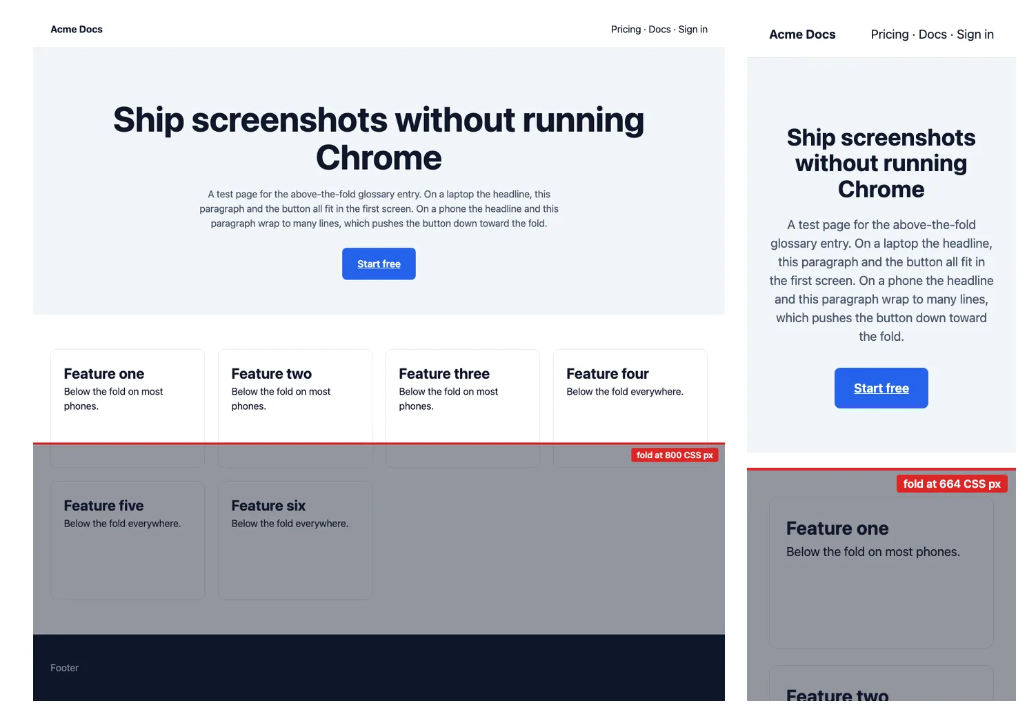
| Viewport (CSS px) | Fold at | Button bottom edge | Button above the fold? |
|---|---|---|---|
| Desktop 1280 x 800 | 800 | 497 | yes |
Playwright iPhone 13, 390 x 664 |
664 | 576 | yes, by 88 px |
Playwright Galaxy S9+, 320 x 658 |
658 | 695 | no |
Playwright iPhone SE, 320 x 568 |
568 | 695 | no |
The page did not change. Only the width did: at 320 CSS pixels the headline and paragraph wrapped onto more lines and pushed the button down by 119 pixels. That is the usual way a call to action falls below the fold on small phones, and it is easy to miss when you only test one device.
How it works technically
The browser lays out the page for the viewport width, then shows the top innerHeight CSS pixels. Three things move the fold in practice:
- Viewport height. Phone browsers show and hide their address bars, so the visible height changes as the visitor scrolls. Emulated viewports in automation tools use a fixed height.
- Viewport width. A narrower width wraps text onto more lines, which pushes content down.
- Late content. Cookie banners, web fonts and images without width and height attributes can shift content after the first paint.
The device pixel ratio does not move the fold, because the fold is in CSS pixels.
How to capture and test it in Puppeteer, Playwright and RenderScreenshot
Puppeteer. A screenshot without fullPage is the above-the-fold view. The script also reports where key elements sit relative to the fold.
import puppeteer from 'puppeteer';

const url = process.argv[2] ?? 'https://example.com';
const selectors = ['h1', 'a', 'p']; // change to your headline and call-to-action selectors

const browser = await puppeteer.launch();
try {
  const page = await browser.newPage();
  await page.setViewport({ width: 1280, height: 800 });
  await page.goto(url, { waitUntil: 'load' });
  await page.screenshot({ path: 'above-the-fold.png' }); // viewport only: fullPage defaults to false

  const report = await page.evaluate((sels) => {
    const fold = window.innerHeight;
    return sels.flatMap((sel) => {
      const el = document.querySelector(sel);
      if (!el) return [];
      const { top, bottom } = el.getBoundingClientRect();
      return [{ sel, top: Math.round(top), bottom: Math.round(bottom), fullyAbove: bottom <= fold }];
    });
  }, selectors);
  console.table(report);
} finally {
  await browser.close();
}
Playwright. Device profiles make phone folds easy to test. On our test page this printed h1 above the fold, a below the fold, p below the fold.
import { chromium, devices } from 'playwright';

const url = process.argv[2] ?? 'https://example.com';
const browser = await chromium.launch();
try {
  const context = await browser.newContext({ ...devices['iPhone SE'] }); // 320 x 568 CSS px viewport
  const page = await context.newPage();
  await page.goto(url);
  await page.screenshot({ path: 'above-the-fold-mobile.png' });

  const fold = page.viewportSize().height;
  for (const sel of ['h1', 'a', 'p']) {
    const box = await page.locator(sel).first().boundingBox();
    if (box) console.log(sel, box.y + box.height <= fold ? 'above the fold' : 'below the fold');
  }
} finally {
  await browser.close();
}
RenderScreenshot. The default capture mode is viewport, so every request without full_page=true is an above-the-fold screenshot. Set the viewport you want to check, or use a device preset. Block cookie banners so they do not cover the fold.
# Desktop fold
curl --get https://api.renderscreenshot.com/v1/screenshot \
  -H "Authorization: Bearer $RS_API_KEY" \
  --data-urlencode 'url=https://example.com' \
  -d width=1280 -d height=800 -d block_cookies=true \
  --output fold-desktop.png

# Phone fold (iPhone 14 Pro: 390 x 844, scale 3)
curl --get https://api.renderscreenshot.com/v1/screenshot \
  -H "Authorization: Bearer $RS_API_KEY" \
  --data-urlencode 'url=https://example.com' \
  -d device=iphone_14_pro -d block_cookies=true \
  --output fold-phone.png
Tested on 2026-10-15 with Node 22.18, Puppeteer 24.43.1 (run in headless shell mode) and Playwright 1.64.1, against a local test page. The RenderScreenshot requests follow the GET endpoint docs and were not run for this page.
Common mistakes
- Testing one phone. As the table shows, 70 CSS pixels of width can decide whether the button is visible. Test at least one narrow device.
- Capturing with a banner. A consent banner can cover half the fold. Hide or block it before you judge the layout.
- Lazy-loading the hero image.
loading="lazy"on an above-the-fold image delays the most visible picture. See lazy loading. - Measuring after scroll.
getBoundingClientRect()is relative to the current scroll position. Measure at scroll position 0.
Related terms
- Device pixel ratio: changes sharpness, not what fits.
- Lazy loading: content below the fold often loads only on scroll.
- Headless browser: what runs the measurements above.
To check your own page without code, try the above-the-fold checker. For phone profiles and touch emulation, see the mobile screenshots guide. To capture folds across devices from one API, create a free account.