The viewport meta tag is an HTML <meta name="viewport"> element that tells mobile browsers how wide the layout viewport should be and how far to zoom, most often width=device-width, initial-scale=1.
Without it, a phone assumes the page was built for desktops and lays it out at a desktop width, then shrinks it. With it, the page lays out at the phone's own width and its media queries apply. Screenshot tools that emulate a phone honour the tag too, which makes it the hidden reason many mobile captures look wrong. This entry is part of the screenshot and rendering glossary.
A plain explanation
The first smartphone browsers met a web made for desktop screens. They pretended to be about 980 pixels wide, rendered the page as a desktop would, and let people zoom in. Responsive sites needed a way to say "I can handle a narrow screen; give me the real width". The tag is that switch:
<meta name="viewport" content="width=device-width, initial-scale=1">
width=device-width sets the layout width to the device's CSS width. initial-scale=1 starts at 100% zoom.
With and without the tag, measured
We captured the same small page, with a breakpoint at 600 pixels, at a 390 x 844 viewport, once without the tag and once with it, with mobile emulation on:
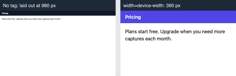
isMobile: true, on 2026-10-15. The header turns purple only when the 600-pixel media query matches.| Mobile emulation | Tag | Layout width | Mobile CSS applied | 16px text drawn at |
|---|---|---|---|---|
| off | none | 390 | yes | 16 px |
| off | width=device-width |
390 | yes | 16 px |
| off | width=1024 |
390 | yes | 16 px |
| on | none | 980 | no | about 6 px |
| on | width=device-width |
390 | yes | 16 px |
| on | width=1024 |
1024 | no | about 6 px |
| on (Playwright iPhone 13 profile) | none | 980 | no | about 6 px |
"Drawn at" is the CSS font size multiplied by the zoom (visualViewport.scale). Tested on 2026-10-15 with Node 22.18, Puppeteer 24.43.1 (headless shell mode, Chrome 148) and Playwright 1.64.1 (Chromium 156).
The first three rows are the point: without mobile emulation the tag does nothing, so a desktop-mode capture at phone width shows the mobile layout even for a page that real phones render at 980 pixels. Only an emulated phone shows what a phone shows.
How it works technically
When the browser runs in mobile mode, it reads the tag before layout. width sets the layout viewport, either a number or device-width. The browser then picks a zoom so the layout fits the screen: 390 / 980 is about 0.4, which is why the text in the left capture is tiny. initial-scale, minimum-scale and maximum-scale adjust that zoom; user-scalable=no blocks pinch zoom in some browsers, which hurts accessibility. Desktop browsers do not support the tag, so automation tools only apply it with mobile emulation on.
How to test it in Puppeteer, Playwright and RenderScreenshot
The tag belongs to the page; your job is to turn on mobile emulation so it takes effect.
Puppeteer: isMobile: true in the viewport:
import puppeteer from 'puppeteer';

const browser = await puppeteer.launch();
try {
  const page = await browser.newPage();
  await page.setViewport({ width: 390, height: 844, deviceScaleFactor: 3, isMobile: true, hasTouch: true });
  await page.goto('https://example.com');
  const layoutWidth = await page.evaluate(() => document.documentElement.clientWidth);
  console.log(layoutWidth === 390 ? 'tag honoured' : `laid out at ${layoutWidth}px: no viewport tag?`);
  await page.screenshot({ path: 'phone.png' });
} finally {
  await browser.close();
}
Playwright: a device profile sets isMobile along with the viewport, ratio and user agent:
import { chromium, devices } from 'playwright';

const browser = await chromium.launch();
try {
  const context = await browser.newContext({ ...devices['iPhone 13'] });
  const page = await context.newPage();
  await page.goto('https://example.com');
  await page.screenshot({ path: 'phone.png' });
} finally {
  await browser.close();
}
RenderScreenshot: a phone or tablet device turns on mobile emulation, which applies the page's tag the way a real phone does. You can also set viewport.mobile with a custom size. See the devices reference.
curl --get https://api.renderscreenshot.com/v1/screenshot \
  -H "Authorization: Bearer $RS_API_KEY" \
  --data-urlencode 'url=https://example.com' \
  -d device=iphone_14 \
  --output phone.png
import { Client, TakeOptions } from 'renderscreenshot';

const client = new Client(process.env.RS_API_KEY);
const image = await client.take(TakeOptions.url('https://example.com').width(390).height(844).mobile());
The RenderScreenshot snippets follow the API docs and were not run for this page.
Common mistakes
- Testing mobile layouts with only a narrow window. As the table shows, that hides a missing tag. Use mobile emulation.
- Judging by eye. Read
document.documentElement.clientWidthunder mobile emulation, as the Puppeteer script does. 980 means the tag is missing or not parsed. - Fixing the width to a number.
width=1024forces a desktop layout on phones, the same as having no tag. - Disabling zoom.
maximum-scale=1, user-scalable=nostops people from enlarging text, an accessibility problem, and does not improve a screenshot.
Related terms
- Viewport: the layout area the tag sets.
- Device pixel ratio: how many image pixels each CSS pixel becomes on the phone.
- User agent: the other part of a mobile profile, read by servers.
If your captures show a desktop layout at phone size, read why a screenshot shows the wrong layout. For phone captures with a device preset, get a free API key.