srcset is an attribute of <img> and <source> that lists several files of the same image at different widths or densities, so the browser can download the one that best fits the layout slot and the screen's pixel density.
For screenshots, srcset means one thing: the viewport and device pixel ratio you choose decide which image file the page loads, and so how sharp the photos in your capture are. This entry is part of the screenshot and rendering glossary.
A plain explanation
Without srcset, every visitor gets the same file: phones download a desktop-size photo, and high-density screens get a soft one. With it, the page offers a menu:
<img src="/hero-400.png"
     srcset="/hero-400.png 400w, /hero-800.png 800w, /hero-1600.png 1600w"
     sizes="(max-width: 600px) 100vw, 400px"
     width="400" height="200" alt="Product hero">
400w says "this file is 400 pixels wide". sizes says how wide the slot will be: the full viewport on narrow screens, 400 CSS pixels otherwise. The browser does the maths and picks a file.
Which file headless Chrome picked
We served that exact markup from a local server. Each candidate is a solid colour block labelled with its own width, so the capture shows which file the browser chose. We logged every image request and read img.currentSrc:
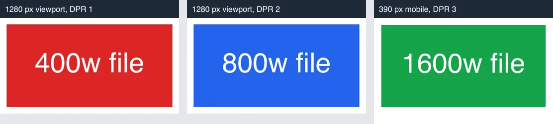
<img srcset> captured with Puppeteer at three viewport and DPR settings, 2026-10-15. Each panel is scaled to the same width for comparison.| Viewport and DPR | Slot width from sizes |
Pixels needed | File requested |
|---|---|---|---|
| 1280 px, DPR 1 | 400 | 400 | hero-400.png |
| 1280 px, DPR 2 | 400 | 800 | hero-800.png |
| 390 px mobile, DPR 3 | 390 (100vw) | 1,170 | hero-1600.png |
| Loaded at DPR 2, then set to DPR 1 without reload | 400 | 400 | still hero-800.png |
| Playwright context, 1280 px, DPR 2 | 400 | 800 | hero-800.png |
Each case requested exactly one file. The last Puppeteer row is the trap: once Chrome holds a larger candidate, it keeps it, so a capture loop that changes the scale between shots on the same page does not get the file a fresh visitor would get.
How it works technically
For w descriptors, the browser takes the first sizes condition that matches, resolves it to CSS pixels, multiplies by window.devicePixelRatio and picks a candidate at least that wide. Browsers are allowed to choose differently, for example a smaller file on a slow connection, or a cached larger one, as the reload test showed. For x descriptors ([email protected] 2x) the browser matches the density directly. <picture> with <source media> is different: there the page decides, by media query, and the browser must obey.
How to control it in Puppeteer, Playwright and RenderScreenshot
Set the viewport and device pixel ratio before the page loads; that is all srcset reads.
Puppeteer:
import puppeteer from 'puppeteer';

const browser = await puppeteer.launch();
try {
  const page = await browser.newPage();
  await page.setViewport({ width: 1280, height: 800, deviceScaleFactor: 2 }); // before goto
  await page.goto('https://example.com', { waitUntil: 'load' });
  const chosen = await page.$$eval('img', (imgs) => imgs.map((i) => i.currentSrc));
  console.log(chosen); // the files the browser actually picked
  await page.screenshot({ path: 'dpr2.png' });
} finally {
  await browser.close();
}
Playwright. The ratio belongs to the context, so a new context gives a clean image cache too:
import { chromium } from 'playwright';

const browser = await chromium.launch();
try {
  const context = await browser.newContext({ viewport: { width: 1280, height: 800 }, deviceScaleFactor: 2 });
  const page = await context.newPage();
  await page.goto('https://example.com');
  await page.screenshot({ path: 'dpr2.png' });
} finally {
  await browser.close();
}
RenderScreenshot. Set scale (1 to 3) in the request, or a device, which sets the viewport and scale together. Send one request per scale rather than reusing one page. See viewport options.
curl --get https://api.renderscreenshot.com/v1/screenshot \
  -H "Authorization: Bearer $RS_API_KEY" \
  --data-urlencode 'url=https://example.com' \
  -d width=1280 -d height=800 -d scale=2 \
  --output dpr2.png
import { Client, TakeOptions } from 'renderscreenshot';

const client = new Client(process.env.RS_API_KEY);
const phone = await client.take(TakeOptions.url('https://example.com').device('iphone_14'));
The measurement and both browser scripts were tested on 2026-10-15 with Node 22.18, Puppeteer 24.43.1 (headless shell mode, Chrome 148) and Playwright 1.64.1 (Chromium 156). The RenderScreenshot snippets follow the API docs and were not run for this page.
Common mistakes
- Raising the scale for sharper photos when the page has no larger candidate. The browser can only enlarge the biggest file it is offered.
- Changing the scale after load. As measured, the browser keeps the larger file it already has. Navigate again in a fresh page or context.
- Forgetting lazy images.
loading="lazy"images below the fold pick their candidate only when they come near the viewport. See lazy loading. - Paying for DPR 3 thumbnails. A 1,600-pixel photo in a 400-pixel thumbnail is wasted bytes. The retina screenshots guide covers when 2x is worth it.
Related terms
- Device pixel ratio: the multiplier
srcsetreads. - Viewport: the width that
sizesmedia conditions test. - Lazy loading: when the choice happens for images below the fold.
To see which files your own pages serve at 1x and 2x, get a free API key and capture them at both scales.