Image resize fit is the rule that decides how an image is scaled into a target box whose shape differs from the image: it can crop to fill the box (cover), shrink to show everything (contain), stretch (fill), or only guarantee one side (inside and outside).
The same idea appears in CSS as object-fit, and in image libraries such as sharp as the fit option. This entry is part of the screenshot and rendering glossary.
A plain explanation
A screenshot of a desktop page is wide: 1280 x 800 is a 16:10 shape. A thumbnail slot in your app might be square. You cannot put a wide image into a square without giving something up. You can cut off the sides, leave empty bands, distort the image, or return an image that is not square. Each fit mode picks one of those trade-offs.
The five modes on one screenshot
We captured a 1280 x 800 test page with a coloured marker in each corner and a circle in the middle. Then we fitted it into a 400 x 400 box with each mode. The dashed red square is the target box.
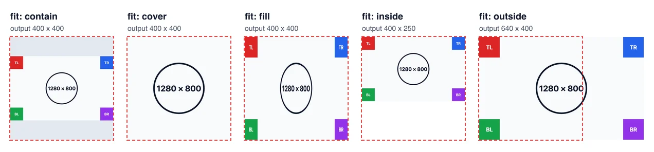
| Mode | Output (measured) | Keeps ratio | Crops | Pads | CSS object-fit |
|---|---|---|---|---|---|
cover |
400 x 400 | Yes | Yes, 240 px of each side before scaling | No | cover |
contain |
400 x 400 | Yes | No | Yes | contain |
fill |
400 x 400 | No | No | No | fill |
inside |
400 x 250 | Yes | No | No | scale-down (when shrinking) |
outside |
640 x 400 | Yes | No | No | none |
The corner markers make the loss visible. cover removed all four. fill kept them but turned the circle into an oval, which also squeezes any text. Only contain, inside and outside show the full page.
How it works technically
Every mode computes two scale factors: box width divided by image width (400 / 1280 = 0.3125) and box height divided by image height (400 / 800 = 0.5).
- contain and inside use the smaller factor, 0.3125, so the whole image fits: 400 x 250.
containthen pads to 400 x 400 with a background colour.insidestops there. - cover and outside use the larger factor, 0.5, so the image covers the box: 640 x 400.
coverthen crops to 400 x 400 around a chosen position, centre by default.outsidestops there. - fill uses both factors, one per axis, so the shape changes.
CSS object-fit does the same calculation when it draws an <img> inside its own box. The browser keeps the full file and only changes how it is painted. A server-side resize writes new, smaller pixels.
How to set it in Puppeteer, Playwright and RenderScreenshot
Neither Puppeteer nor Playwright has a resize option for screenshots. They can change the viewport or crop with clip, but to scale a finished capture you need an image library. Both examples use sharp.
Puppeteer.
import puppeteer from 'puppeteer';
import sharp from 'sharp';

const url = process.argv[2] ?? 'https://example.com';
const browser = await puppeteer.launch();
let png;
try {
  const page = await browser.newPage();
  await page.setViewport({ width: 1280, height: 800 });
  await page.goto(url, { waitUntil: 'networkidle0' });
  png = await page.screenshot(); // Puppeteer has no resize option
} finally {
  await browser.close();
}
for (const fit of ['cover', 'contain', 'inside']) {
  const info = await sharp(png)
    .resize({ width: 400, height: 400, fit, background: '#ffffff' })
    .webp({ quality: 80 })
    .toFile(`thumb-${fit}.webp`);
  console.log(fit, `${info.width}x${info.height}`);
}
Playwright. For page thumbnails, cropping from the top usually beats the centre, because the header and hero are at the top.
import { chromium } from 'playwright';
import sharp from 'sharp';

const url = process.argv[2] ?? 'https://example.com';
const browser = await chromium.launch();
try {
  const page = await browser.newPage({ viewport: { width: 1280, height: 800 } });
  await page.goto(url);
  const png = await page.screenshot();
  // Crop to the top-centre instead of the middle with position: 'top'.
  const info = await sharp(png)
    .resize({ width: 400, height: 400, fit: 'cover', position: 'top' })
    .toFile('thumb-pw.png');
  console.log(`${info.width}x${info.height}`);
} finally {
  await browser.close();
}
RenderScreenshot. output.resize takes width, height and fit, with the same five mode names. The default is contain. It is a POST option.
curl -X POST https://api.renderscreenshot.com/v1/screenshot \
  -H "Authorization: Bearer $RS_API_KEY" \
  -H "Content-Type: application/json" \
  -d '{
    "url": "https://example.com",
    "viewport": { "width": 1280, "height": 800 },
    "output": {
      "format": "webp",
      "quality": 80,
      "resize": { "width": 400, "height": 400, "fit": "cover" }
    }
  }' \
  --output thumb.webp
If the target size is a standard card, you may not need a resize at all: the og_card preset captures at 1200 x 630. See the presets reference.
Tested on 2026-10-15 with Node 22.18.0, Puppeteer 25.14.0 (Chrome 155), Playwright 1.64.1 (Chromium 156) and sharp 0.35.5 against https://example.com. The RenderScreenshot request follows the API specification and was not run for this page.
Common mistakes
fillon a web page. Text and logos get squeezed. Use it only when the source and box already have almost the same shape.- Resizing to get the mobile layout. A smaller image of the desktop design is still the desktop design. Set a mobile viewport width instead.
- Blurry thumbnails on high-density screens. A 400 px tile on a 2x screen needs 800 physical pixels. Resize to twice the display size, or capture with a higher device pixel ratio.
- Centre crops on long pages.
covercrops around the centre by default, which often keeps the middle of the hero and cuts the heading. Crop from the top.
Related terms
- Viewport: the layout size, which a resize does not change.
- Device pixel ratio: pixel density, the other way to change output size.
- Image compression quality: the second lever for file size.
To try the fit modes on your own pages, get a free API key.