A print stylesheet is the set of CSS rules a page applies only when the media type is print, written with @media print or attached with media="print", so the printed or PDF version can drop navigation, ads and colours that make sense only on a screen.
Browsers apply it when you print or save as PDF. Headless browsers can also apply it to a live page on request, which lets you take a screenshot of the print layout. This entry is part of the screenshot glossary.
What it means in plain terms
Every page has at least two audiences: the screen and the printer. CSS lets a page say "on paper, hide the menu, use a serif font, and write each link's address after the link text". Those rules live in the print stylesheet and are ignored on screen.
The media type is a property of the output, not of the page. Switch it to print, and the same HTML gets a different look with no reload.
The same page, screen and print
We built a short release-notes page with a dark navigation bar, a yellow promotion box, and a print stylesheet that hides both, switches to Georgia and prints link addresses.
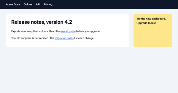
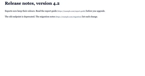
print media emulated (bottom). Puppeteer 25.14.0 and headless Chrome 155, 2026-10-15, scaled to 600×315 WebP. The only change between the captures is the emulated media type.How it works technically
There are three ways to attach print rules, and emulation honours all of them:
<!-- 1. A block inside any stylesheet -->
<style>
  @media print {
    nav, aside, .cookie-banner { display: none; }
    a[href^="http"]::after { content: " (" attr(href) ")"; }
  }
</style>

<!-- 2. A whole file that applies only to print -->
<link rel="stylesheet" href="/print.css" media="print">

<!-- 3. An import with a media condition -->
<style>@import url("/print.css") print;</style>
Scripts can check the media type with matchMedia('print').matches, and many sites also listen for the beforeprint and afterprint events, for example to expand collapsed sections before printing. That is where print emulation and real printing part ways. In our test page:
| Action in Puppeteer | media="print" stylesheet applied |
beforeprint / afterprint fired |
matchMedia('print') change event fired |
|---|---|---|---|
page.emulateMediaType('print') |
Yes | No | No |
page.pdf() |
Yes | Yes, both | n/a |
So a print-emulated screenshot shows the print CSS but not changes that a site makes in JavaScript at print time. If the page depends on them, dispatch the event yourself: window.dispatchEvent(new Event('beforeprint')).
Two more differences from real printing: a screenshot keeps background colours (printers drop them unless "Background graphics" is on), and it ignores @page size and page breaks. Those belong to CSS paged media.
How to set it
Puppeteer
import puppeteer from 'puppeteer';

const browser = await puppeteer.launch();
try {
  const page = await browser.newPage();
  await page.setViewport({ width: 1200, height: 630 });
  await page.goto('https://example.com', { waitUntil: 'load' });

  await page.screenshot({ path: 'screen.png' });

  // Apply @media print rules to the live page, then take a normal screenshot.
  await page.emulateMediaType('print');
  await page.evaluate(() => window.dispatchEvent(new Event('beforeprint'))); // for JS print hooks
  await page.screenshot({ path: 'print.png' });

  // page.pdf() uses print media on its own. Switch to screen for a "what you see" PDF.
  await page.emulateMediaType('screen');
  await page.pdf({ path: 'screen-styles.pdf', format: 'A4', printBackground: true });
} finally {
  await browser.close();
}
Playwright
import { chromium } from 'playwright';

const browser = await chromium.launch();
try {
  const page = await browser.newPage({ viewport: { width: 1200, height: 630 } });
  await page.goto('https://example.com');
  await page.emulateMedia({ media: 'print' });
  console.log('matches print:', await page.evaluate(() => matchMedia('print').matches));
  await page.screenshot({ path: 'print-pw.png' });

  await page.emulateMedia({ media: null }); // back to the default
} finally {
  await browser.close();
}
Tested on 2026-10-15 with Node 22.18.0, [email protected] (Chrome 155) and [email protected] (Chromium 156), against the release-notes test page and example.com. On the test page, Playwright reported the nav element hidden in print media.
RenderScreenshot
Set browser.media to print in a POST request. The renderer switches the media type before the page loads, so print CSS and matchMedia see it from the start:
curl -sS --fail -X POST https://api.renderscreenshot.com/v1/screenshot \
  -H "Authorization: Bearer $RS_API_KEY" \
  -H "Content-Type: application/json" \
  -d '{"url": "https://example.com", "viewport": {"width": 800, "height": 1000}, "browser": {"media": "print"}, "capture": {"mode": "full_page"}}' \
  -o print.png
An 800 px viewport is close to the width a print stylesheet expects. For a paginated document instead of one image, request "output": {"format": "pdf"}; see the PDF options. The print media screenshots guide has the same request in several languages and how to remove backgrounds for a truly printed look.
Common mistakes
- Testing print CSS only with Ctrl+P. The preview hides some problems. Capture the print layout as an image and compare it in review.
- Expecting
@pageto resize a screenshot. It does not. Set the viewport width. - Relying on
beforeprintfor content. Media emulation does not fire it. Put essential print content in CSS. - Forgetting
media="print"on a large stylesheet. Without the attribute, the browser applies the print file on screen too. - Hiding content the reader needs. Print styles that remove tables or code blocks make the PDF useless.
Related terms
- CSS paged media: page size, margins and breaks for PDF output.
- HTML to PDF: the conversion that applies print CSS by default.
- prefers-color-scheme: another media feature you can emulate before capture.
- Full-page screenshot: how a long print layout becomes one image.
To capture the print version of your own page, get a free API key and run the request above.